The “Meat Joint” button
While I am deeply immersed into the wonderful world of webpage designs and graphics, I still get mildly surprised and annoyed at badly designed products. The kitchen appliance world, it seems, is still full of very lazy design work, especially when it comes to buttons. On this microwave, there are only 7 buttons to press and a dial. I have never pressed 5 of those buttons. One of them is labelled “Meat Joint”. OK, I don’t cook regularly nor eat a lot of meat joints but I just don’t understand the thought process the designers went through, to agree that one of the 7 buttons on a microwave should be dedicated to defrosting Meat Joint.


Simplicity massacred
The second example is perhaps worse. I can see that they have thought long and hard about this. They have designed this dial selection interface which turns like the early iPod (this is from a 3-year-old printer) and tried to balance the whole console with the remaining buttons. To me, this is a crime because they have spent a lot of time and money into developing this dial feature and at the last-minute, probably as a result of consumer focus group or at their line-manager’s whim, it was decided that a bunch of large buttons to perform the traditional functions were needed. On a what was a simplified, clean interface, there are just scattering of hideous and really pointless buttons. I have never pressed any of the large buttons there or most of the smaller ones there. I can access all the functions with the dial!

Now, the nice stuff
I am a long-term Apple user and a huge fan. One of the reasons for this is encapsulated in this photo of the current Apple keyboard. How enticing are these “buttons” or keyboard? It is not just about the ergonomics, the material and the general layout. As many Apple products are, it is simple. It hides the complicated stuff without losing any functionality. Not difficult, it seems, but I know this is difficult to achieve.

Perfect buttons
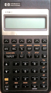
This is one of my all time favourite electronic item. Hewlett Packard 17BII Business Calculator (circa 1998).
My rules for buttons:
- It must do exactly what the button implies it will do – just take a look around and see how many buttons fail to do this simple task
- Feel – You must feel that you have pressed it
- Label – Colour co-ordinate and simplify intelligently. Real-estate on or around buttons are usually very limited. Think very hard about this.
- Ergonomics
Can we learn anything from physical buttons when designing buttons for websites and applications? Well, of course. While it is easier to play with the colour and positioning of buttons on a screen, my rules still applies. In many ways, it is harder to design buttons on a website or an application. Your mouse pointer is now your thumb and the ergonomics is now to do with distance from the input box or the centre of the screen. If you need to write more than 2 words to describe what the button does, don’t write it on the button. While the button on the screen might initiate a series of complex procedures, make sure the button describes the implied result, not the process.
I am lucky enough to work with one of the masters in application UIs. Watching people like him work makes you appreciate good designs even more.